Poppies 2017

I’ve been playing with various poppy designs for about three years now, and I am in the habit of making a batch of poppy images around the time of Remembrance Day in the UK. As well as a piece of remembrance art, these pieces also speak to me of the blood and tears of war. This year I’ve decided to offer the poppies for sale, and donate some of the proceeds to the Royal British Legion poppy appeal.

Each artwork is painted using Winsor and Newton professional water colours on Aquarelle Arches satin grain 300g/m2 hot pressed 100% cotton paper. Each piece is 10cm x 25cm and will be signed then mounted using 100% acid free tape into conservation grade mount board. I’m selling these for £45 plus £5 P&P each, with a donation of £10 for every sale. The second and sixth in the series have already been sold. Number three has been given away as a free art drop and I destroyed number five, it just didn’t work! Contact me if you’d like to buy one of the remaining artworks, and in so doing, help support a good cause.

Patterning

A few conversations this week have brought to mind the importance of spotting patterns in our work. One off events have their place, and what else do you notice through repeated observations? Is my behaviour today out of the ordinary, or is this how you normally experience me? Should you or I do anything differently as a result? These conversations got pretty deep at times, and as I began to surface, I thought about an artistic interpretation of what had been spoken.

But what to paint? I looked to nature first, the greatest pattern maker of all.

IMG_4348.jpg

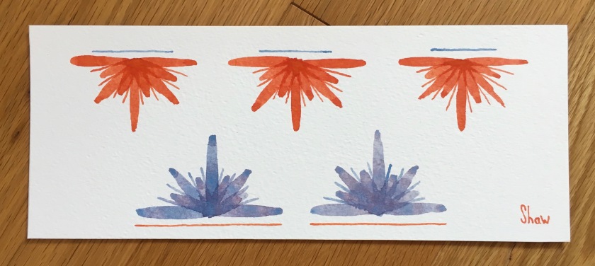
The bottom row emerged first, hints of something floral? The top row came next. Plant life of some sort, maybe coral? I enjoyed watching the paint strokes interact, each overlapping movement creating a darker shade than the original stroke. Mixing slight variations from my paintbox – not identical patterns, just exploring similarities.

I’m enjoying working on panoramic paper at the moment so I cut a sheet from a larger piece, and reworked the patterning.

IMG_4349


This time I mixed my shades from liquid watercolour, blending alizarin crimson with cerulean blue and cadmium yellow. Slightly bolder tones, the basic shape the same, the overlapping, darkening shades. This piece of patterning will be the next free art drop. If you live in my neighbourhood, keep an eye out for it over the weekend.

Learning to Paint – Aspect of Spring

Here’s a little sketch of crocuses I painted from memory today. It’s a practice of some of the techniques I learned at Leapday.The perspective is wonky and I think some of the leaves have some interesting patterns in them. The dominant colour is W…

Here’s a little sketch of crocuses I painted from memory today. It’s a practice of some of the techniques I learned at Leapday.The perspective is wonky and I think some of the leaves have some interesting patterns in them.

The dominant colour is Windsor Violet and I tried to get different shades by using different amounts of paint and water. Getting the mix right felt very hit and miss, this wet on wet technique is tricky.

Aspect_of_spring