Edge of Glory : Revisited 

Edge of Glory is one of my favourite works, I enjoy making the design and looking at it afterwards. I was recently asked to revisit it using a hotter colour palette than the original blue version. I’ve been experimenting with an orange which works well alongside Cadmium Red, and in the past few days, I got the mix right. 

Digital Artefacts

Anne McCrossan has many talents – and the one I want to highlight today is her work as a ceramicist. Anne works in Cornwall using local clay to make a range of fascinating objects. Through a clever use of digital iconography in her work, she blends the art of making with a nod to the online world in which some of her other work inhabits.

I admire this connection between making with our hands and interacting in a digital workd, and for some time I’ve wanted to explore this intersection through my visual art. I dropped Anne a line yesterday to see if she was OK with me pursuing this. She is, and after I woke very early today, and couldn’t get back to sleep – I got to work. My intention was to create a simple backdrop through repeating a technique of wet on wet watercolour I have used previously, combined with a gradual addition of a second paint pigment. Here are photos showing how I set up my workspace, and the finished, graded watercolour washes.

IMG_4509.jpg

IMG_4511.jpg

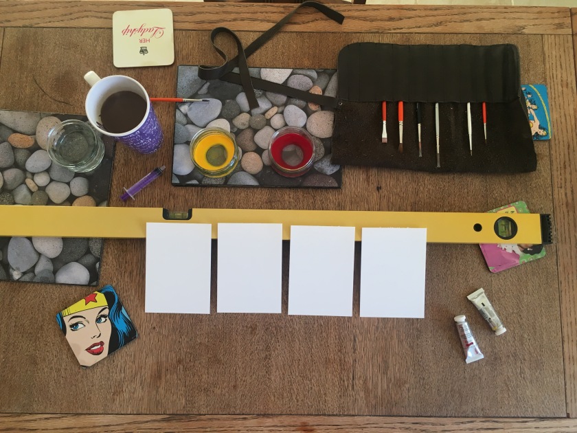
I had to make all four of these pieces simultaneously – gradually adding measures of red paint to the yellow as I move down the sheets of paper.

Once the paint was dry, I pencilled an outline of the icon I wanted to use, applied some gilding paste and gold leaf, then waited…

IMG_4524.jpg

I had to apply the gold leaf three times, trying to fill in gaps where it hadn’t stuck to the paper properly. In the end – I got a close enough representation.

IMG_4537.jpg

As a first attempt I am pleased with the result – I particularly like the tonal shift in the watercolour. This piece will be the free art drop this weekend, given away a little later than usual. Note to self – don’t leave it so late in the week to try a fiddly new experiment next time!

Patterning

A few conversations this week have brought to mind the importance of spotting patterns in our work. One off events have their place, and what else do you notice through repeated observations? Is my behaviour today out of the ordinary, or is this how you normally experience me? Should you or I do anything differently as a result? These conversations got pretty deep at times, and as I began to surface, I thought about an artistic interpretation of what had been spoken.

But what to paint? I looked to nature first, the greatest pattern maker of all.

IMG_4348.jpg

The bottom row emerged first, hints of something floral? The top row came next. Plant life of some sort, maybe coral? I enjoyed watching the paint strokes interact, each overlapping movement creating a darker shade than the original stroke. Mixing slight variations from my paintbox – not identical patterns, just exploring similarities.

I’m enjoying working on panoramic paper at the moment so I cut a sheet from a larger piece, and reworked the patterning.

IMG_4349


This time I mixed my shades from liquid watercolour, blending alizarin crimson with cerulean blue and cadmium yellow. Slightly bolder tones, the basic shape the same, the overlapping, darkening shades. This piece of patterning will be the next free art drop. If you live in my neighbourhood, keep an eye out for it over the weekend.