Signals – Part Two

Just over two years ago, I rattled off a sketch titled Signals – Part One. I’d always intended that sketch to be part of an ongoing series, exploring the tension between digital and analogue, regular and irregular. It’s taken me a while – but here, finally, is Signals – Part Two, complete in a little oak frame.

Signals - Part Two
Signals – Part Two

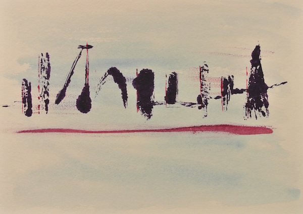
In this sketch, the regular is represented in the straight lines (initially drawn using a ruler) leading out from the top right hand side of the sketch. The fan lines are drawn freehand, and then blue acrylic paint has been splurged and brushed into each tick, or v shape. Lastly – the small hint of orange water colour is there to represent a little dissonance in the signal, a bit like the hiss and crackle on a vinyl record.

This sketch has been mailed to someone in Derbyshire, and who knows – maybe a Part Three will be along sometime…

In Response to Flow

A group of us were discussing constraint as a driver for creativity at Art for Work’s Sake last week. An offer was made for people to write a haiku based on flow (one of the words suggested earlier in the evening for the desired mood of the session), and Alex Hyslop came up with this lovely poem:

Streams can gurgle slow
Rivers can thunder faster
Lakes just sit and wait

Next we drew and painted some responses to the haiku, and the evening moved on. After the session had finished, a few of us were clearing up at the end and someone handed me this sketch:

In Response to Flow

I really like this picture, I think it is a mix of paint, pen, pencil and charcoal and it’s a great partner with the haiku. A lot of my work is about bringing different people together to see what we might learn from each other and I really like how two people who hadn’t met prior to the workshop came up with these two lovely pieces of work. I put a photo of the sketch on Facebook and found out the the artist is Robert Ordever. So – here it is – the first ever piece of guest artwork on the artsensorium. Thank you Robert for agreeing to let me share this here.

Acrylic Printing

November 2014.

I facilitated an Art for Work’s Sake session recently which produced some interesting and unexpected results, including the first print ever made in one of these workshops.

Inspired by these printed works I thought I’d give the technique a try today. At first I had it in mind to try printing a skyline in acrylic onto a water colour wash. I had a few attempts, using way too much paint at first:

Too Much Paint

A couple more attempts followed – this time with less paint, producing a very different effect. The print either barely copied or splurged.

Skyline

Something I observed from this session is the effect that a heavy load of acrylic paint makes when you pull the original away from the print surface. I’ll see how I can use this in future.

DSC_3819

I found this afternoon frustrating so I scribbled some angry wax pastel and crayon onto cartridge paper before packing up for the afternoon.

DSC_3810

I thought I felt in the mood for some art today – maybe not?

Update: Jan 2016. I reflected on writing this post and playing with using acrylic paint to make these prints – and  I’ve come to really like the work. I ended up cutting out sections of the purple and white printed paper and made four small pieces of art from it. Together they are ‘The Art and Soul of Better Work’. I kept one – and I gave the other three away.

Update: Jun 2016. Several people have remarked on the skyline painting/print, saying how much they like it. I’m in the process of producing a limited edition print of the design.